


Preview
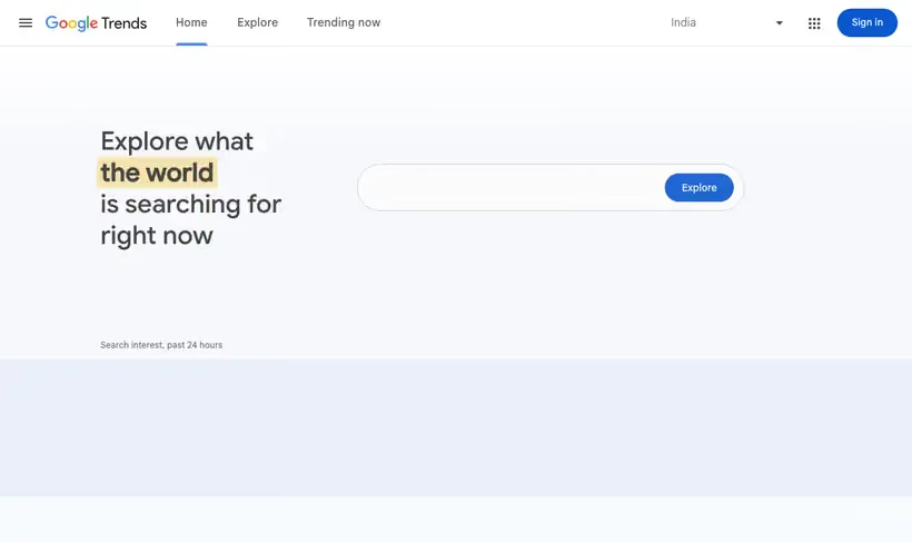
What it is.
Trends answers the direction question. It divides each data point by the total searches for that place and period, then scales what's left from 0 to 100 against the topic's own peak.
Volume tools tell you how big a term is today. Trends tells you which way it's moving, which is usually the question behind a category bet.
What you get.
- A five-year shape for any term, showing whether demand is building or fading.
- Your brand against two rivals on one chart, as a share-of-search proxy.
- Rising queries, which surface the phrasing people use before keyword tools index it.
- The months when demand arrives, so campaigns run in the right weeks.
How to set it up.
Enter the term, then switch it to a Topic where one exists so synonyms and misspellings are counted together.
Set the range to 5 years first to see the shape, then narrow to the last year for the recent picture.
Add a competitor brand as a second term, since the comparison is more useful than either line alone.
Read Rising queries before Top queries, because rising is where the new phrasing shows up.
Treat any 0 as low volume and not as absence, since Trends only shows data for popular terms.
Pricing Plans
Web interface
$0
no login, CSV export per chart
Use cases
Early or late
Chart five years of a term before you commit a content quarter to it.
Share of search proxy
Put your brand against two rivals on one chart and watch the gap move.
Catch a rising phrase
Check rising queries each month and add the new phrasing to your briefs.
Best for
Testing whether a category is growing
Five years of relative interest tells you if a term is a rising demand curve or a fading one before you commit a content budget.
Brand share of search
Compare your brand against two competitors on the same chart and you have a demand proxy nobody has to buy.
Finding seasonality
A 5-year view shows the months when demand arrives, which is when campaigns should be live.
Open the tool
Opens on Google in a new tab.